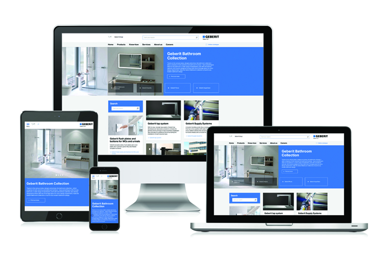
Geberit has re-launched its website, with a new look and navigation system making it easier than ever to browse the extensive product range and find all the information needed to design, specify and install.
Enabling customers to find the information they need at a glance, the new-look Geberit website features a responsive design to make it particularly easy to use with a smart phone, according to the company. Whether viewed on a desktop, mobile or tablet, the new website is simple to navigate, with a straightforward menu structure and tiles directing the user to relevant information.
Integrated into the website, the Online Product Catalogue is accessible via a link on the top menu, while search results now include direct links from the online product and spare parts catalogue. Each product page also has a ‘Pro Area’ with direct links to the Online Product Catalogue, making it easier for retailers, installers, architects and end users to find the information they need.
The website also now features a Reference Projects section that can be filtered by product and sector, a Video Centre where videos can be viewed and downloaded, as well as a Download Centre.
“The online world has moved on a lot since the current website was launched in 2013. Everyone now uses a mobile to browse the internet, with over 30% of visitors to the Geberit website now using a mobile or tablet device,” explains James Lanchbury, Digital Marketing Manager at Geberit. “This made it vital to ensure that the site is easily navigable no matter how it is being accessed, while also taking the opportunity to introduce new features to make it user-friendly.”
Browse the new-look website at: www.geberit.co.uk


